Master pivot tables, pivot charts and advanced Excel formulas.
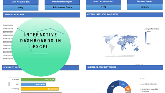
Throughout this course, you will acquire the skills and knowledge necessary to master the art of creating dynamic and engaging Excel dashboards. You'll start by planning your dashboard layout using wireframes. This journey will encompass constructing pivot tables and pivot charts to serve as the backbone of your dashboards. You will delve into the creation of essential key metrics, turning raw data into actionable insights. Further, we'll explore the utilization of slicers to effortlessly filter and interact with your dashboard. Additionally, you'll gain proficiency in working with a diverse range of Excel formulas, enabling you to perform calculations for those critical dashboard metrics. To add the finishing touch, you'll discover how to use Excel tools like shapes and colors to give your dashboards a clean and professional look.

Accounting Guru
Jason is a Charted Management Account and Certified Public Accountant (CPA) of Australia who has over fifteen years of financial services experience in England and Switzerland in banking and real estate. After his move to Australia, he spent three years working as a lecturer and course designer in the fields of accounting and general business studies. Prior to his move to Australia, he worked as a consultant for a college, designing and rolling out learning programs across South Africa. Programs included simulated work environments to satisfy the work experience requirements of accounting institutes with which students were registered. He set up a non profit organization in South Africa to uplift mathematics and language education standards in rural areas.
